Occasions provide creative moments for retail marketers to have fun with and we see different trends prevalent for these special moments in the consumer calendar.
So how can we make the most of these times to ensure maximum impact, turning shoppers into buyers at point of purchase?
First of all, we need to understand what the key influences are for the various occasions.
Christmas retail marketing themes are centered around ‘giving and sharing’ for adults, whilst ‘Santa’s visiting’ excitement drives visual communications for the younger market.
There is an emotion for every brand manufacturer to have fun with at Christmas.
‘Back to School’ tends to create some feelings of urgency and needing to be prepared for the year ahead.
Easter is an occasion that we see our confectionery brands compete for basket share through colours and cute bunny characters, and bakery brands compete to offer families that special Easter morning spread.
Halloween is something different altogether.
Unlike Christmas and Easter where shoppers are wooed by their favourite brand, Halloween does not necessarily see brands being supported by loyal shoppers; this occasion is about which display stands out spooktacularly to get that trick or treat impulse sale.
Halloween gets the imagination going! With spooky imagery and mystical themes, visual merchandising becomes the deciding factor that separates one retail display from another, and has the ability to see brand switching – with the grander and more theatrical display winning consumers over in the last 3 feet of the shopper journey!
Key design mechanisms to make a show stopping Halloween display that caters to both brand marketers’ budgets and shoppers alike.
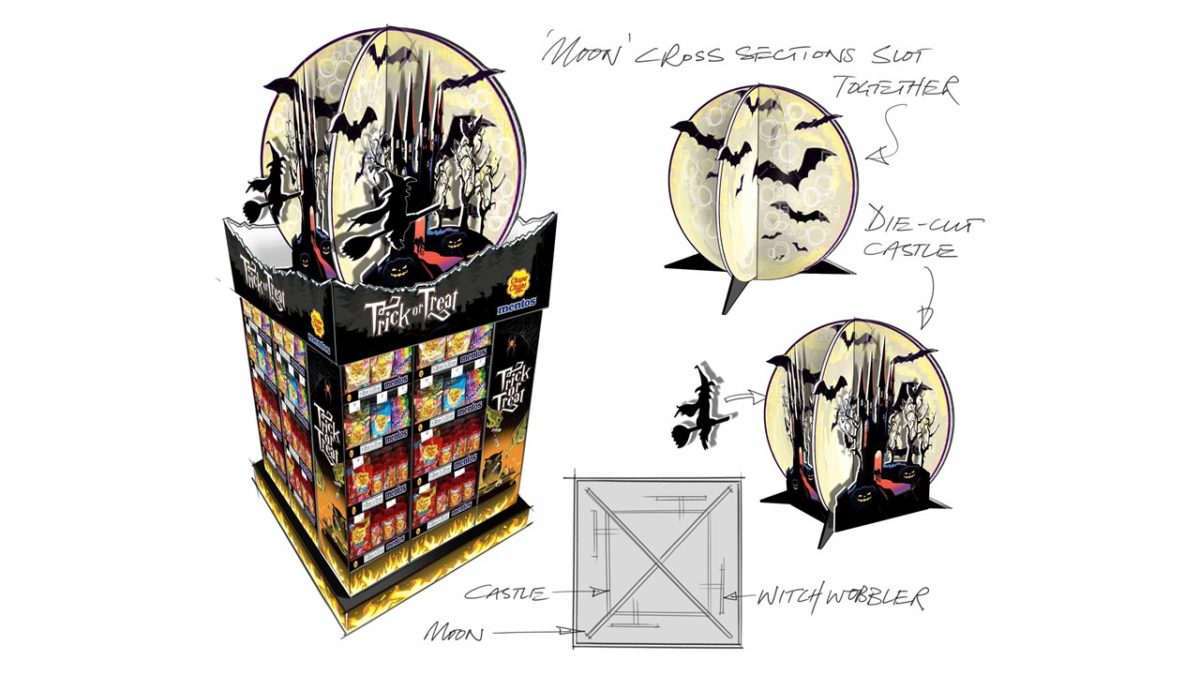
- Cut through the Halloween clutter: This is the time to channel your artistic visual merchandiser sole! Create theatre with 3D elements that capture the imagination. Get creative with materials!
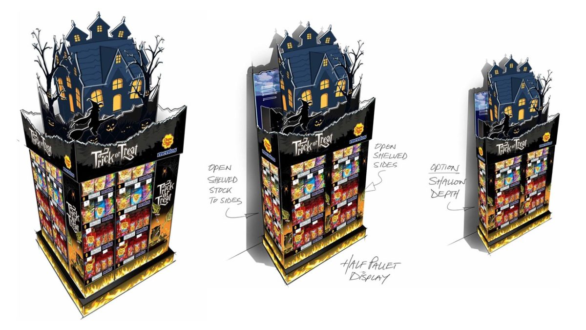
- The ingenious cardboard design: Design structures using printed and die-cut shapes, transitioning a flat 2D display into a 3D spectacular that doesn’t require complex assembly.
- The space invader: Design flexible displays with the ability to adapt instore. Quarter pallet, half pallet, island display, check-out or gondola-end; if you get a display into the golden retail arena, ensure your display is easy to assemble with the ability to be in any location in store.
- Add motion to stimulate dwell and engagement: Increase display visibility utilising cost effective “rocker” movements with battery powered characters like the witch on her broomstick combined with a dramatic moon backdrop as you can see in the Chupa Chups & Mentos Halloween Display video.
Case study: Chupa Chups & Mentos Halloween Display
Creating instore theatre was key to disrupting passing shopper whilst providing product exposure.
Using recyclable materials and a mechanical rocker, we engineered a display solution that was focused heavily on the theatre component as well as providing an adaptable shelf solution suited to promote a large range of co-located Chupa Chups and Mentos products.
The display provided great visibility instore with a theatrical and layered header piece enabling the shelves to display product and communicate Halloween “trick or treat” messaging.
Talk to the creative team at id8 Studio about tips to increase your displays shopper engagement and dwell time in that last key 3 feet of the shopper journey.
Want to know more about Occasion based marketing at POP? Read The New Occasion blog.
Let us help you turn shoppers into buyers!


