New Real Estate in-store
At a time where the world is facing unprecedented challenges, we find ourselves looking outside the box for retail solutions to support brands retail activities in-store.
There are many area’s in-store where we are thinking of creative options for product placement that both suit the retailer and shopper alike. Every space is at a premium, so we always seek out new space and ways to display products.
Grocery shelves change constantly; whether it be because retailers put in action new restrictions or new store designs are implemented. It has always been a challenge to design displays for longevity, but it’s our aim to produce both sustainable and adaptable solutions.
id8 Studio designs which have created new retail space.
Odyssey Unit
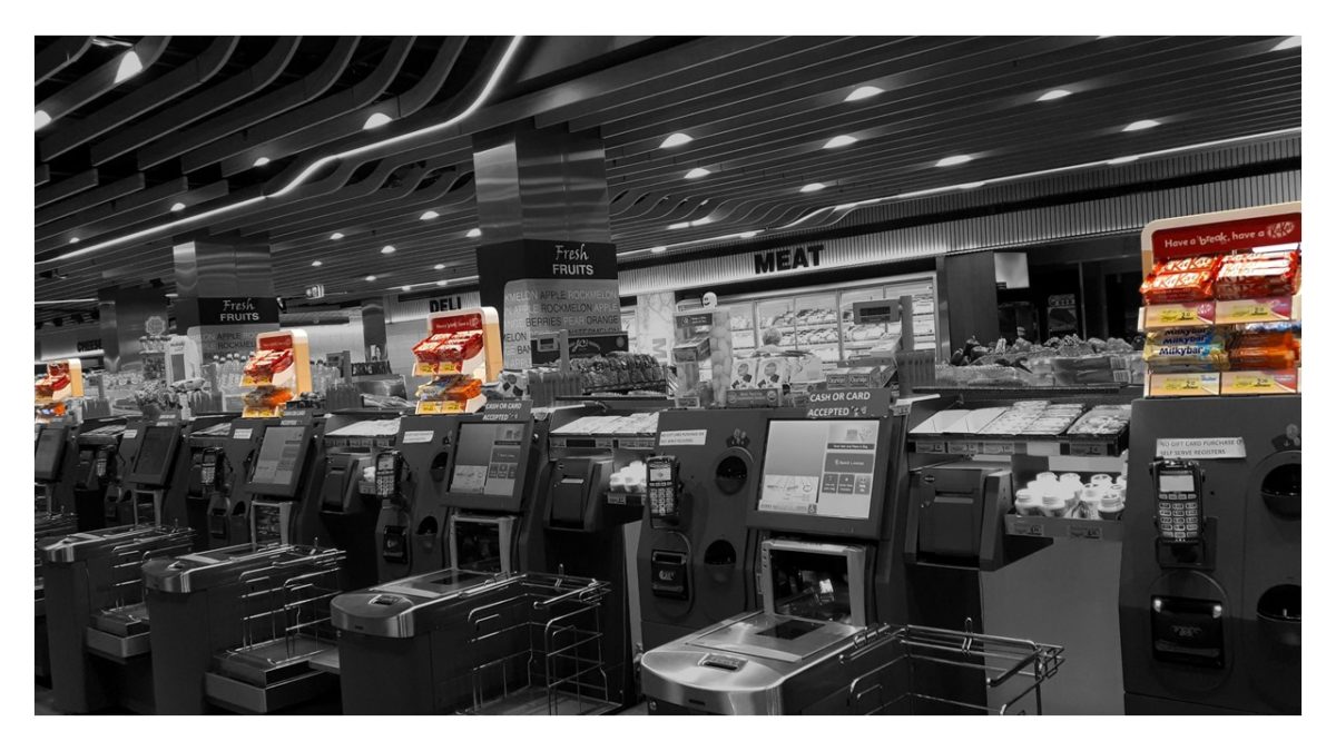
Objective: Win back front of store at Independent stores with a focus on providing our field team with the right POP display unit, utilizing unused ‘airspace’ into valuable selling space, driving incremental sales of our ‘gold range’ of merchandise (includes KITKAT, other confectionery and cold solutions).
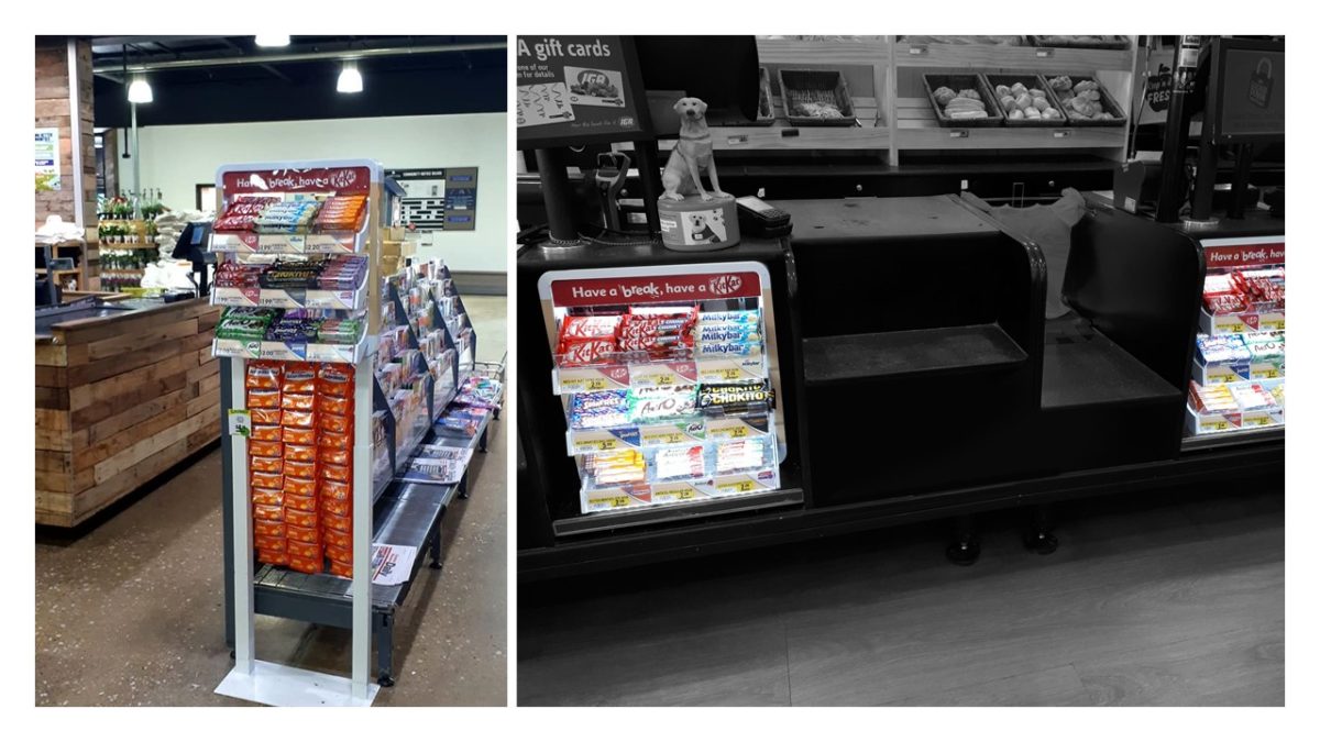
Design Solution: The Odyssey Unit is premium, yet neutral, with a clean white frame, woodgrain effect on shelves and integrated smart lighting. The design created new real estate, transforming airspace around checkouts into selling space.
- SLEEK: Aesthetically fit into any store décor
- FLEXIBILITY: Display to adapt to a variety of different locations
- ADAPTABLE: Compatible with all store footprints and hardware
- PERMANENT: Secured to store hardware to create permanency
- SEAMLESS: Integrated into the overcrowded express checkout area
- ADAPTABLE: Easy for the field to assemble and expand without the use of tools
Ghost Post
Objective: The grocery store objective was to improve the overall consumer shopping experience by removing outrigger posts intruding into the aisle to all fixtures.
This would have a serious impact of the growth of the impulse category; therefore a solution was required to regain visibility of cross-category sales within Woolworth’s stores that adhered to Woolworth’s open-shelf policy & had minimal impact on the new fixture layout.
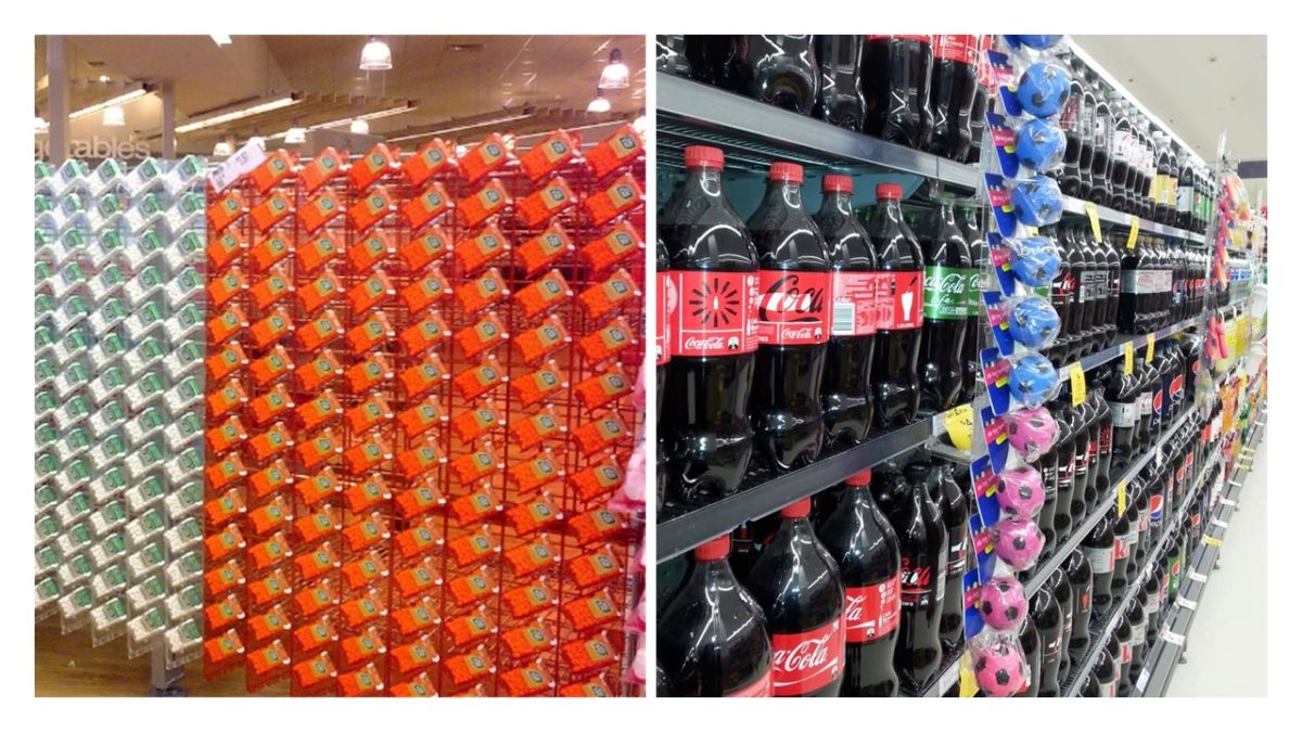
Design Solution: We designed a POS solution that allows impulse products to be merchandised in ‘post-less’ Woolworth’s stores. The “ghost post” display blends seamlessly into the environment.
Key features:
- The simple brackets are clear & have zero impact on the shelving capacity for existing products – making the Ghost post a genuine ‘intrusion-free’ device.
- Adhere to Woolworths clean aisle policy – “seen but not seen”
- Restock the posts with ease (no time lost learning how to operate a new fixture)
- This cost-effective solution gave an excellent ROI in a space that had been considered unusable.
- Consumable components such as the hang sell strip are produced from recyclable Polypropylene substrate.
- The polycarbonate structure is designed to last over 5 years in store & is rigid to withstand continuous interaction within the retail environment.
The simple brackets are clear & have zero impact on the shelving capacity for existing products – making the Ghost post a genuine ‘intrusion-free’ device.
With many years of experience designing creative display solutions for POP, the team at id8 Studio would love to work with you on your next project. How can we help you deliver your brand and product to shoppers?


